Why I Love Material Design for Dashboards
Humans are touchy feely
Tactility is in our DNA. We can't resist touching a fuzzy sweater. We need to feel a door shut solid behind us to feel safe. We desire a plush chair to rest in. Simply put, we're very tactile beings. People expect the same sensations with digital experiences. Evolving design trends have been searching for this unexplainable delight, and material design is a step closer. Skeumorphic styles achieved tactility, but were incredibly tacky. Flat designs struck the world with their simplistic beauty, but they lacked feel.
As a trained Industrial Designer, I've been searching the perfect balance of beauty and physical feel in my digital designs. Enter Material Design. About a year and a half ago, I began creating analytics templates that leveraged flat cards or tiles with variable shading to emphasize a hierarchy of information. I didn't have a name for it, but it was working. Fast forward to today, and Google has completely redesigned their search product to leverage material design. The analytics industry should take notice.

My material design concept for the Numerify app
It clarifies importance of information
In dashboard design, we often have multiple levels of information to display. But we should always let the user know they should be looking at. Let's put that content closer to them. We should provide visual cues that offer a peculiar physical familiarity. By using simple shading, we can create an effect that raises the elements just a touch. It's the most elegant way to say "Hey, look at me" in digital design.

Using material design for feedback
It's stupid flexible
Even with a simple white card, the fundamentals of surface, light, and movement are extremely powerful. The smallest movement can trigger divisions that serve as indicators for our brains. Just as material shading can be used to create a hierarchy of information, it can also be used to indicate the ability to take action. I've found a beautiful implementation of this in Numerify's home screen. We use workflows that allow users to launch from cards into more detailed views. By adding a few more pixels of shading behind a card on hover, we can avoid all obtrusive ornamentation and the user knows they can click. By sticking with one indication paradigm across multiple interactions, users can focus on meaningful content from the get go.

Using shading as breadcrumbs
It lets a product tell a story
Analytical workflows are crucial to our business use cases at Numerify. We strive to guide users from a high level insight to a pinpointed root cause. Once you've gotten to a detail, it's imperative to retrace your footsteps on the spot. The trail is what teaches users to uncover patterns and discover eye opening correlations. With material design, we can elevate the click points, leaving tracks along the way. These shaded waypoints are like chapters in a story.
To learn more, check out Google's material design resource.
Simplified Sophistication: Numerify Website Revamp

As part of an ongoing brand positioning project, we decided to tackle a new website design. I'm very pleased with the result and happy to announce it's now live! The goal of the new site was to showcase our high-end brand, express our friendly approach to analytics, and concisely articulate our business value.
Homepage: Focus on typography
So often in this industry we hear the line "I just don't understand what you do". I wanted to kill that once and for all, at least for Numerify. To my advantage, we're witnessing a strong emphasis on typography in the web industry right now, so I decided to leverage that. Working tediously with our copywriter, we came up with the line We help you simplify IT with hassle-free analytics. I was able to show off the site at an event in Las Vegas last week, and I'm proud to say - people get it.
Introduce the product with context
Now that we've established what we do, and why companies need us - I wanted to get straight to the point. The next scroll down the homepage reveals a slick animation of our core product features. It's absolutely crucial connect to value to reality. People want to know what their life will look like using your tool. In a world of noisy software vendors, we have to be concise, and compelling. Check out my previous blog post for a more detailed explanation of the product.

New Product Pages: Telling empathetic stories
This is where we've struggled in the past. Numerify has a lot of products, and we've confused our web users with multiple divergences in the past. The data proved it. Thankfully, we have bread and butter. It's the reason 95% of companies engage with us. We call it IT Service Analytics.
Make our core product feel like a unified solution
We were able to cut the fat, and focus on our core product ( IT Service Analytics). But, there was still a lot going on. Even within this product, there are a lot of facets and details. Putting on my product marketing hat and working with other product team members, we were able to boil it down to 3 features. Operations, Change, and Service analytics. These basically map to different roles within an IT organization. With this in mind, I developed a sub-nav tab structure to highlight these features. The best thing about it is that the 3 tabs don't feel like different pages. It feels cohesive. It gives the sense that the fusion of these things are key to getting value from Numerify.

Tell users what they'll do with our product
Something I've preached on for a while is that we have to tell a story with our product page. What will users do with our app? What will it feel like? What will they click? What will they get out of it? Product usability and business value all expressed in one place. I developed what I call an action-oriented, blended product story. In the past, users might have to visit 3 separate web pages to get this information. Today, it's all in one place.

Customers Page: Brand awareness is mutual
For such a young company, Numerify has an all-star cast of customers with some stellar results with our product. The vitality of our company relies on sharing their success stories. It was very important that we got this page right. I recognized the content had to be polished, but I knew it had to feel like something different.
Connect brand outcomes with Numerify
The general public often pictures IT teams in a dark basement surrounded by server racks. Most don't realize that they are only 1 step removed from enabling the product and brand experiences we have become accustomed to. It's time to give them some credit. The new customer landing page I designed purposely implements a slick background hover effect that highlights the companies core offering. It's a tribute to these standout IT teams, but it's also a hook for our prospects.

Engage our audience with captivating stories
Once a logo is clicked, a succinct customer story appears. The narrative is designed to be empathetic. The stories express the pain these companies felt before Numerify, and the return on investment they're seeing with our product today. We tie in related content to each customer page as well, such as a webinars or detailed case studies they participated in with us. The page has an e-magazine feel to it so users can easily slide to the next story. The idea is to keep the audience engaged with each fluid scroll or swipe.

I believe we've created a site that escapes traditional B2B norms. It aligns with my ongoing desire to bring some delight to the workplace (especially to our IT audience). I encourage everyone to check out the live site at numerify.com.
Meet the new Numerify
I'm excited to give a sneak peek of what the Numerify design team has been cooking up the last several months. Our mission has been to uncover the ultimate value that our business analytics can bring to IT organizations. Today, we're seeing our goal come to life in the product. The result is a design direction that has taken me on a deep dive in user research, an endeavor in product marketing, a plan for market differentiation, and of course core UX design. Take a look at the 3 new pillars of the Numerify product.

1. Tailored for you
The beauty of Numerify is its ability to offer value at all roles of an IT organization. Ranging from boardroom execs, to team managers, to individual contributors, our app has value to add. The platform's ability to correlate IT and Business Data opens the door for meaningful insights. In turn, we arm our users with the intelligence to make swift day-to-day decisions with sound judgement.
Beyond that, we discovered something more interesting. This feature is actually about transparency. Not the obvious mega message board, or some George Orwell 1984-esque feature that lets you see what others are working on. It's something more subtle. We simply want to give users access to information they've never had, giving everyone a unified view of what's really happening in IT. We believe that getting everyone on the same page is key to an enterprise IT department running like a well-oiled machine.
Our stance is that we give users more information they've previously imagined, but no more than they need. This manifests itself in a carefully crafted personalized landing page that leads to a repository of pertinent analyses.
2. Ask any question
After working in the analytics space for 4 years, I've developed a belief that curated analytics are the future. Loads of data are great, but it's up to us designers to show a business user what the heck to do with it. This is my core ethos that serves as my motivation for sophisticated simplicity.
After working with wonderful design partners such as Netflix, Intuit, and REI, I've came to a realization. Cookie cutter dashboards won't always cut it. Companies are unique. Moments arise when they have to uncover insights that are specific to them. To be the best one-stop shop analytics provider, Numerify has to fulfill this need.
Enter "Ask any question". This feature gives users a mechanism to dive deeper once Numerify curated content simply isn't enough. It's tough to admit we don't have all the answers, but it's a beautiful thing to offer a tool with infinite possibilities.
3. Learn from the industry
The most powerful of the 3 pillars, I see this feature as the champion driver for companies to deploy Numerify analytics. This trademark element of our product is the love child of two beautiful realizations.
- IT is being forced to change, and fast. If they don't, they'll lose their jobs. They're facing a digital revolution, where every business is becoming a software business. Whether they manufacture living room sofas or sell allergy medicine, companies are pressured to be very good at building and deploying software. Consequently, they have to learn at an exponential rate.
- Our customers are brilliant and they like to share. Ever since we've given organizations a mechanism to engage in the analytics design process themselves, they've created some remarkable analyses that are very useful to their peers throughout the industry.
This led us to the "learn from the industry" concept. A productized instrument that allows customers to leverage analytics templates from outside organizations and integrate their own data. Now our customers are solving problems at an accelerated rate, and it's quite delightful to watch them smile as they do it.
New Office Endeavors
One chilly February morning, I was sitting at my drab brown cubicle at Numerify's Cupertino office. I was staring at a flock of uncomfortable sales people working around our ping pong table when I got the call I had been waiting for. It was our co-founder on the other line - "Hey, we found a new office, but, umm.... let's just say it needs some work". I was ecstatic as I was beyond ready to escape the coup we had been working in for the past two years. He continued, "We need your help designing the place, but we have to be moved in three weeks".
Later that day, we jumped in his SUV and drove to the new place to check it out. I was cautiously optimistic at this point, but I knew time was not on my side. We had always talked about hiring a firm to help us design a workspace, but we just didn't have time. I knew expectations were high as our entire marketing team had been googling images of top-notch tech offices like Uber's Mission Bay palace and Zendesk's perfectly serene headquarters.
As we rode up the elevator at the new complex, I realized the reality was simple. We're not Uber, AirBnB, or Snapchat. We're Numerify. We need a space to accommodate about 55 people, we sell IT analytics, and sometimes people mispronounce our name as "Humidify". But that's okay, because we're hot, we're on a winning streak, and we need an office to reflect that. Our office needed to be really nice... but "scrappy", inspiring... but "realistic".
The landlord greets us at the front door as we step inside. All I remember thinking was "oh boy, it's dark, it's weird... are we actually going backwards?" We turned the corner and I see rows of open space tables with metal arms sticking out. The scene was grey, dull, and I couldn't help but think the place looked like a robot factory. Simply put, the place needed vitality, it just looked dead.
Vitality became the theme of the project, and I let that serve as the inspiration for every swift decision I would make in the next 3 weeks. Fast forwarding to today, we've only been in the space for a few weeks, but there have been some substantial upgrades. We weren't able to take on any structural changes, but I'm quite pleased with the aesthetics and even some new traffic patterns. It's undoubtedly a work-in-progress, but I wanted to share some of my headway with a few before and after pictures.
Before: The Robot Factory

After: Not so factory
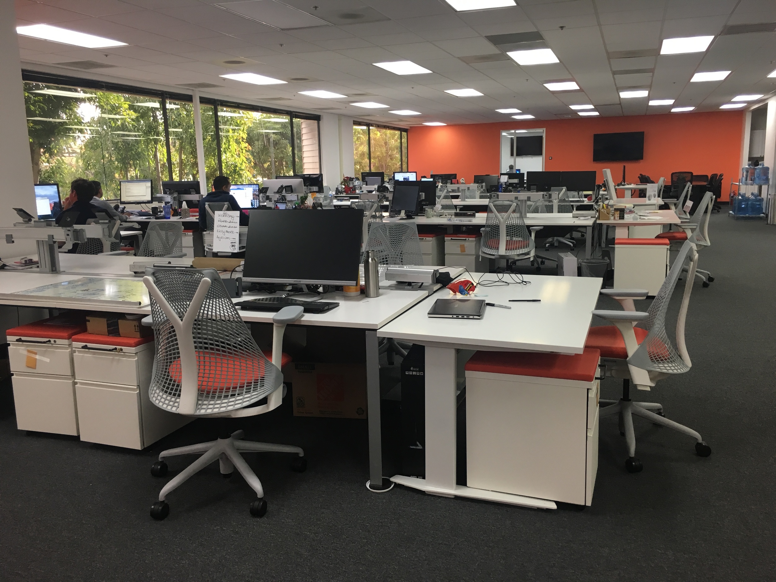
Before: Personal Workspace

After: A spot I don't hate working in

Before: A Very Neutral Entryway

After: Something More Cozy & Lively

A lot of work left, but the new design is receiving some good feedback so far. Next, I'll focus on the conference rooms and kitchen area. It's been interesting watching how people behave in the spaces they inhabit. It's amazing how much their surroundings impact their interactions. Within a couple weeks I'll have some good behavioral data to help influence the common space design. It's a learn-as-we-go process, and I wouldn't have it any other way. The final touch will be to implement the branding elements such as signage, logos, decorations, etc.
Grand Opening Target: Late Spring 2016.
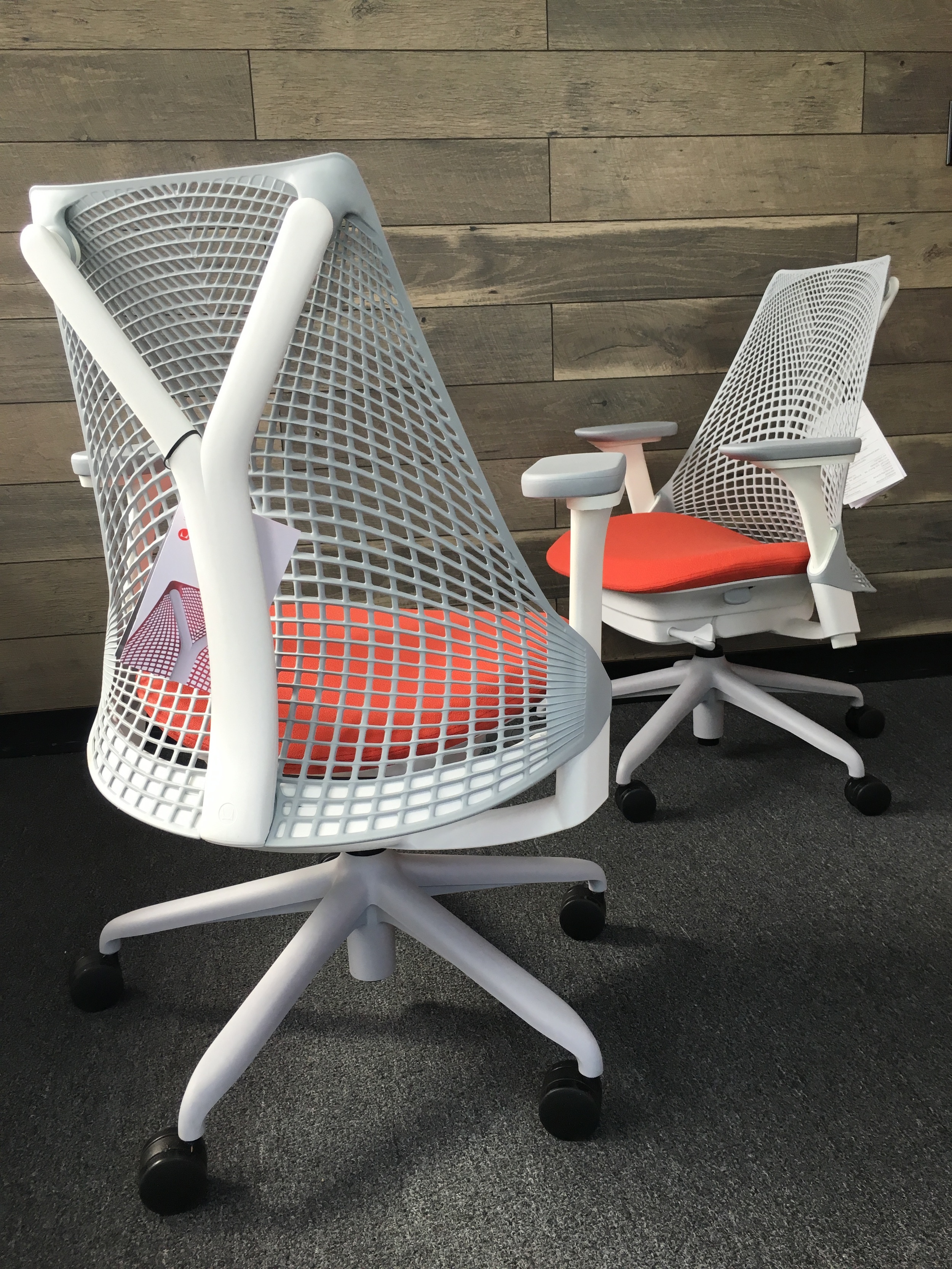
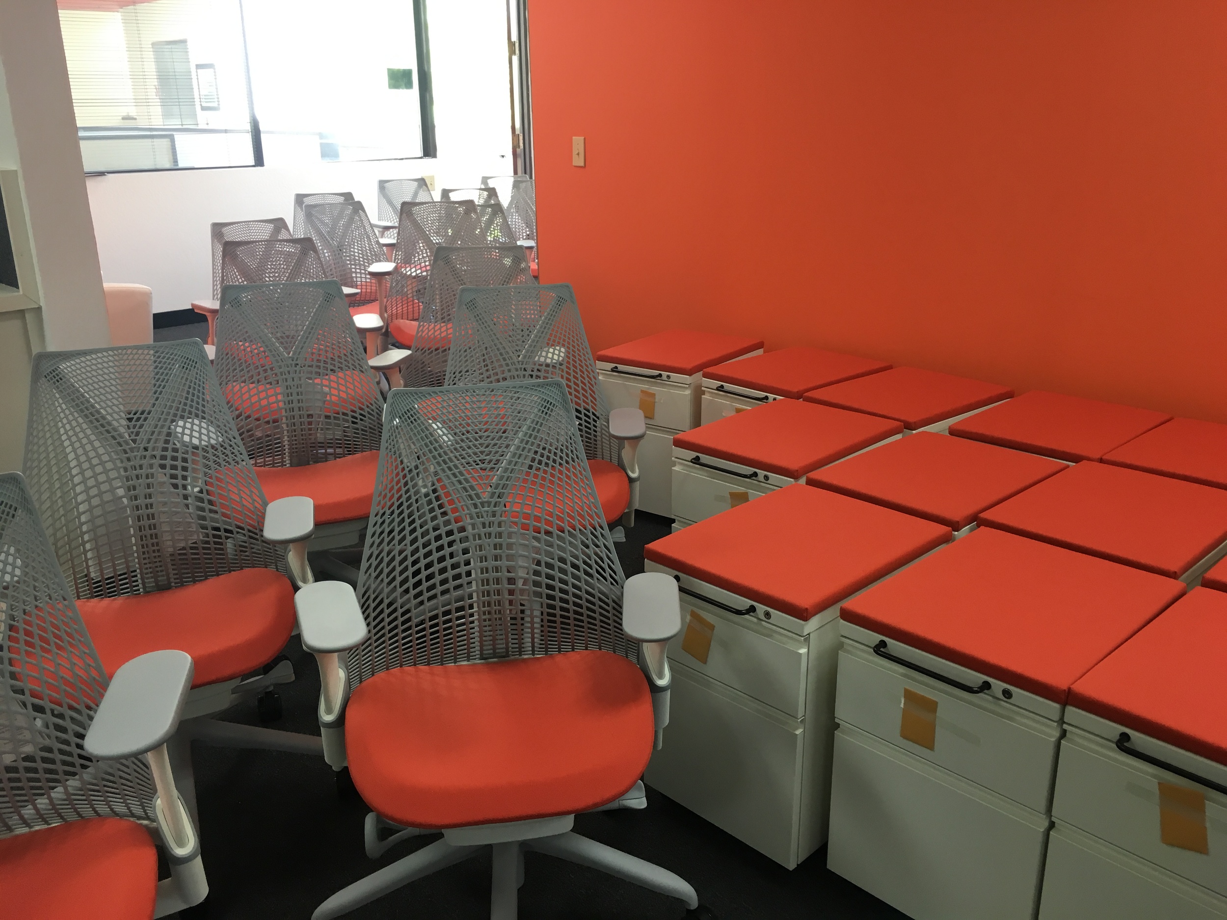
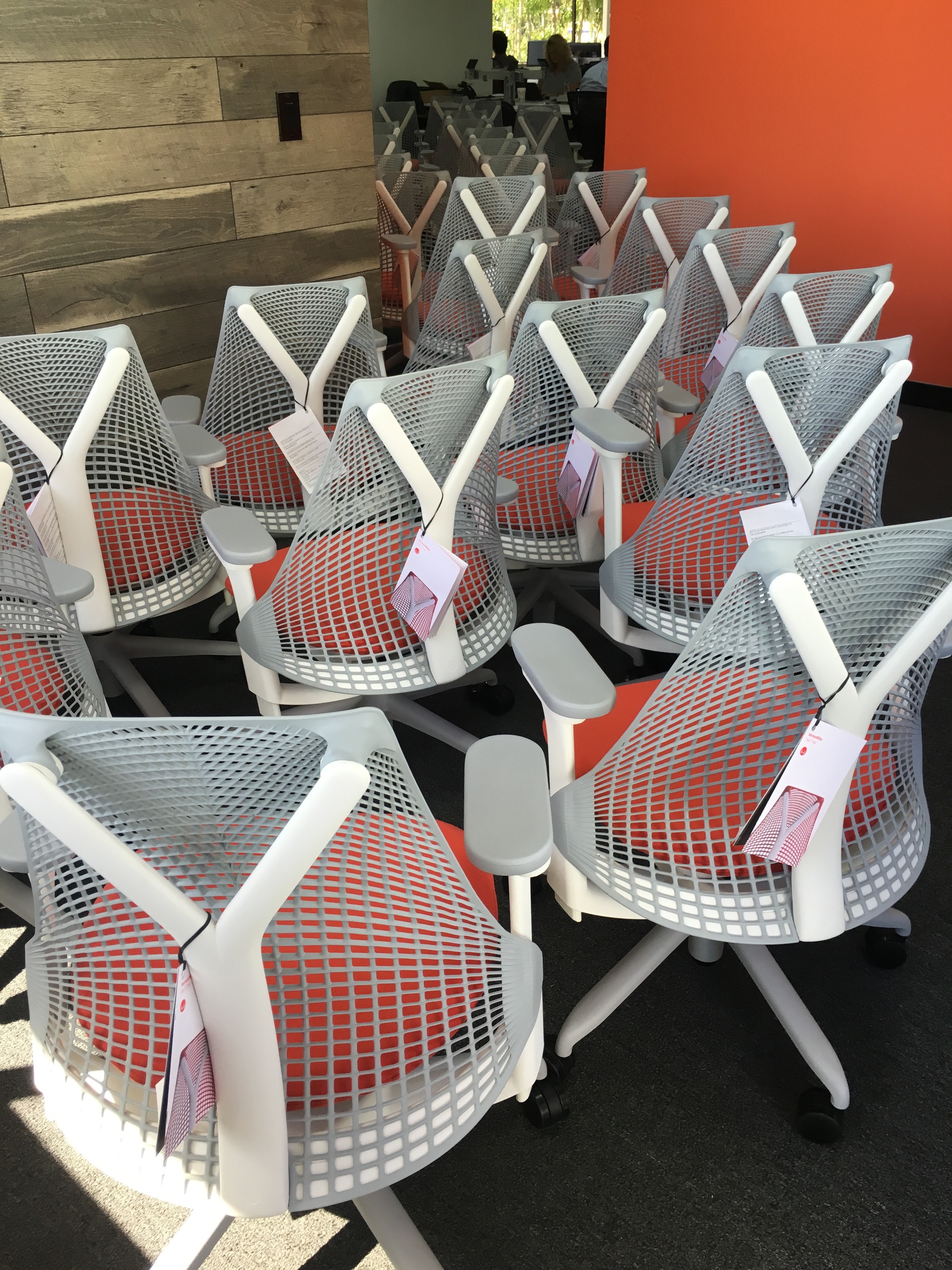
Something extra: My favorite part of the process so far was selecting my beautiful custom Herman Miller furniture. I went with the Sayl Chair and Tu Storage Pedestal. A very fitting selection as the Sayl was inspired by the suspension technology of the Golden Gate Bridge, and designed by someone who has greatly influenced my career, Yves Behar. The final product did a great job reinforcing the vibe of the Numerify brand. Check out our stuff...