
Numerify
Enterprise Business Analytics
End-to-End UX Design
2014-15

Concept: A new way to ease business decisions
The concept of Numerify is to equip IT leaders with the insights to make sounds decisions that help their business. Traditionally, IT has operated without the right tools or information to accurately measure themselves. We discovered IT was sitting on a goldmine of data that was spread throughout their cloud technology systems. Numerify brings together their IT and business data all in one place. With Numerify Analytics, IT leaders are able to make informed decisions that move the business and their personal careers forward.
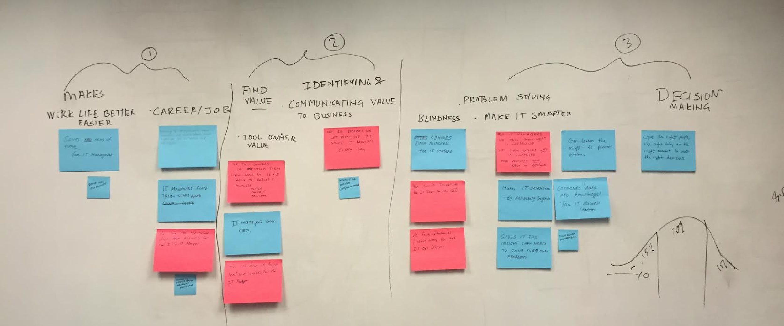
To begin, we started working with industry partners and potential customers to uncover the behaviors, pains, and motivations that drive IT leaders on a daily basis. By visualizing their problems on series of sticky notes, we we're able to organize their needs into the pillars shown below.
Sketching Interactions: Analytical stories
Based on our concepts and research, we discovered it was important to curate workflows within our product. I realized that our users may be surrounded by technology, but they don’t come from hardcore data science backgrounds. I proceeded to sketch interactions to reflect this finding. Whether on desktop or mobile, the nature of our product is to guide a user through an analytical story to arrive at a business insight.

Interaction Principles: Staples to aid friendliness
After we received feedback from our users, I was able to refine and lock in our guided analytics interaction paradigm. At this point, it was crucial to establish principles to serve as beacons for other Numerify designers in the future. The reality was that my team would be creating a lot of content over the next few months, and it was my responsibility to build a framework to support this. The ethos was to create principles that are conducive to recurring usability patterns that will develop our intended user behavior.

Flow Diagrams: From insight to action
A user has many paths to take within the application. To help them get started, I leveraged a card style concept to intelligently bubble up what they really need to know. The sample flow diagram below represents the streamlined path designed to take the user from problem indication to a pinpointed root cause.

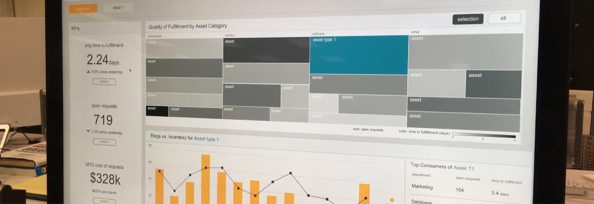
High Fidelity Wireframes: Focusing on business content
To truly understand my design’s validity, it was crucial to work inject real content into the flow. I worked with domain experts and product managers to begin designing dashboard and story content. These content packs were based on actual complex business questions that our user-base faces regularly. Throughout the process, I was frequently able to get the wireframes in front of real enterprise IT users. This was perhaps the most important exercise, as we were able to learn and adjust the designs accordingly.
The following 4 sample screenshots represent 2 different ways to analyze cost control and asset fulfillment for internal customers.

Prototyping: Rounding out workflows
The analytics workflows were then translated into interactive prototypes for our internal and external stakeholders. Depending on the complexity needed, I used clickable PDFs, Invision prototypes, or Keynote flows. We were able to find out where our stories lacked clarity or left something to be desired. Concurrently, we were able to iterate on more detailed interaction paradigms along the way.
Final Implementation: First shipped product
The original Numerify design delivery concentrated on two major parts: The universal navigation patterns and a rich content pack os business focused story screens in the IT domain. We rigorously refined details on how content links together as well as the business validity of our use cases. V1 of our product shipped in April of 2014, with V1.1 shipping in April of 2015. The updated version improved our homescreen and expanded our content packs to new business domains.
